An Introduction to Microsoft Azure Machine Learning Studio - Part 5
Let's wind this up and roll in some catnip...
Data Science Altitude for This Article: Camp Two.

As we concluded our last post, we used Azure ML Studio to attach a Logistic regression model to some data for a hypothetical electrical grid (11 predictor variables). We had a first look at the output which scores whether our response variable as adequately predicted, and promised a dive into the scoring. We’ll get to that, but first I’d like to put together another, competitive model to compare and contrast to our Logistic regression efforts. Let’s give a warm welcome to Neural Networks…
Trying to convey the moving parts of neural network calculations in a single post would be a fool’s errand. It’s a subject deserving of more than a passing reference, and I’ll post a few links to some resources to look at if you all don’t have a massive list of your own. We’ll have plenty of ground to cover on the subject of the ROC curve we touched on in the last post. So something has to give…
Educate yourself on neural networks (or any other model type you employ) so that you understand its limitations and assumptions before you use it in anything other than a toy setting.
Finishing up our model
Our goal here, however, is to get a feel for Azure ML Studio. I’ll hit the high points of the methodology and attempt to do it justice. Here’s where we left the layout for the experiment we had in our last post:
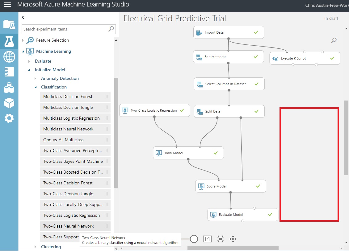
What we’re going to do now is leverage our ‘Split Data’ control and funnel our train/test dataset output ports into another model type. We’ll add a model control and additional train and score controls into the section in red above.
To get to that point, and using some of the same processes we’ve used in prior posts:
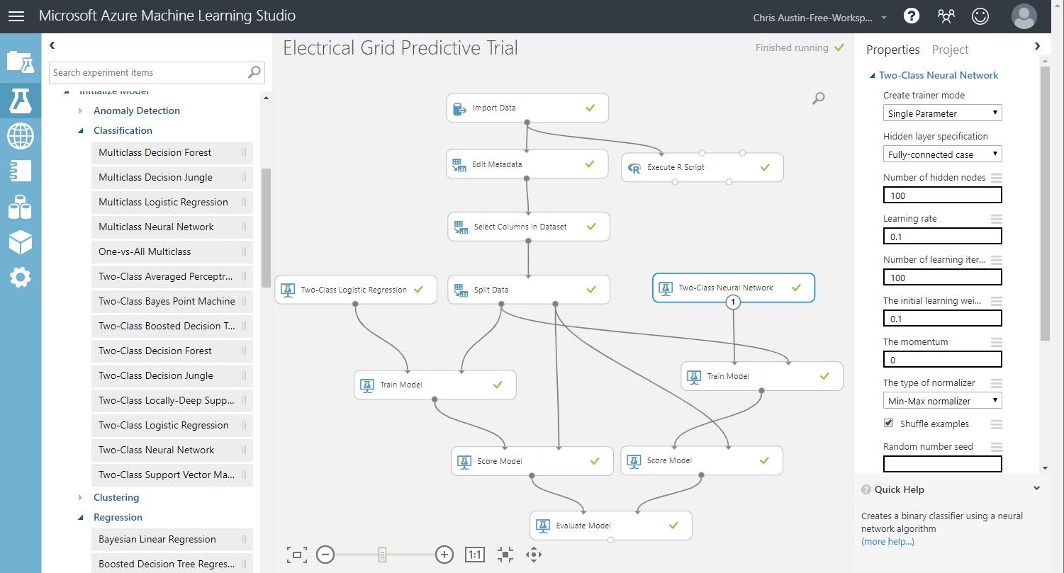
Drag a ‘Two-Class Neural Network’ control onto the experiment and take the default options for the number of hidden nodes, etc.
Drag a ‘Train Model’ control onto the experiment. Use the column selector to nominate ‘stabf’ as the response variable.
Drag a ‘Score Model’ control onto the experiment.
Wire them together as seen in the diagram below, an have the output from the new ‘Score Model’ feed the unused input port in ‘Evaluate Model’.
Click ‘Save’ and then click ‘Run’. All controls should have green checkmarks.
That completes our model building, and with no additional code other than our exploratory analysis. Awesome! So let’s see what that buys us:
Results of the Evaluated Model
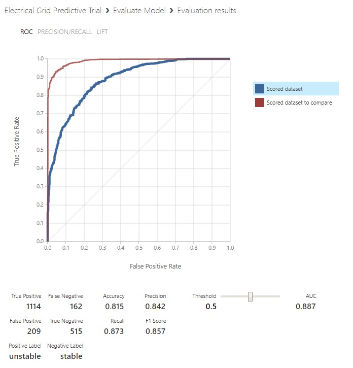
Click on ‘Evaluate Model’ and choose ‘Visualize’. The first, ‘Scored Dataset’ model that shows is the one we set up for Logistic regression using the 20% of the data (2000 records out of the original 10000) we set aside to grade the effectiveness of our predictions. It’s the blue ROC curve:
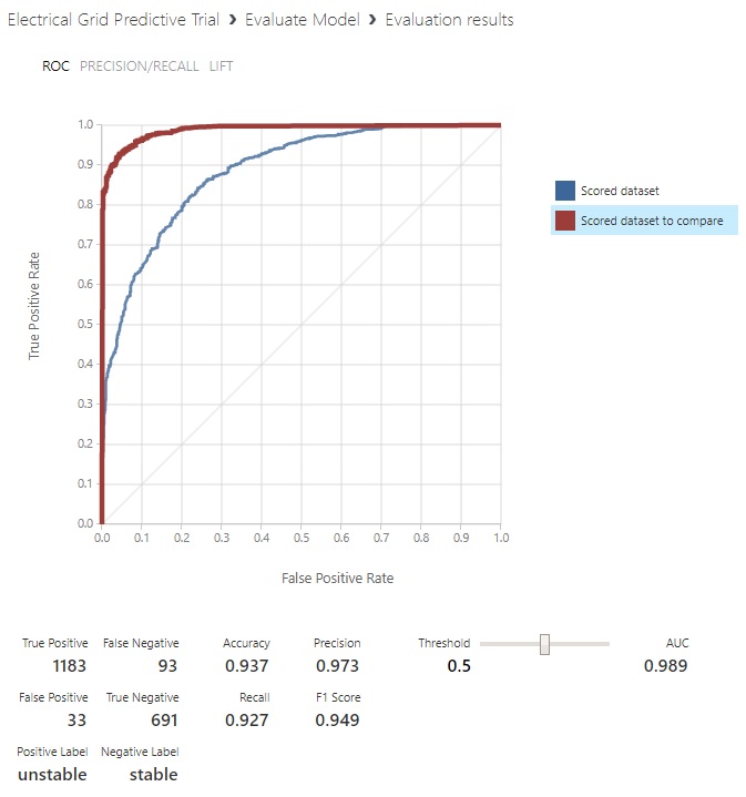
Clicking on ‘Scored dataset to compare’, we’re provided with predictions from the Neural Net:
Great, but what does this mean? Take a quick look at the bottom there, where it notes what the positive and negative labels are for the chart. Interesting… Now would be a good time for a brief discussion of the properties of a confusion matrix.
Don’t Be Confused – a primer regarding the Confusion Matrix and ROC Curves
While there are probably better technical articles on the subject matter of Receiver Operating Characteristic, the one on the Wikipedia page is nice in that it has everything in one spot and has hovertext for definitions. And it’s a little better for the beginner, in my opinion. So let’s focus on the section highlighted below (in red) in the context of our electrical grid experiment.
In supervised learning when we match up a model’s predicted classifications with the data’s actual class, we use a confusion matrix to tally the correctness or lack thereof for our classes. From there, all sorts of corollary statistics are derived to help us understand the ramifications of our predictions.
Looking at the ROC curve output from ML Studio, some things may be starting to line up for you. It says at the bottom that the positive label corresponds to the condition of the system being unstable and that the negative label corresponds to the condition of the system being stable.
That’s a bit backward from how we’d normally consider it. But that’s an outcome of our data being split 60% unstable and 40% stable, so it’s just picking the most numerous class as the ‘positive outcome’. No worries, at the end of this section we’ll re-cast the highlighted part in terms of the experiment.
So, if ‘Condition Positive’ = Unstable network, and ‘Condition Negative’ = Stable network, what’s next?
For each of our 2000 rows we saved to score with, it uses our predictors and result field ‘stabf’ to tally the four possible results:
True Positive (TP) = Model predicts Unstable, true value in data (‘stabf’) shows Unstable
False Negative (FN) = Model predicts Stable, true value in data (‘stabf’) shows Unstable
True Negative (TN) = Model predicts Stable, true value in data (‘stabf’) shows Stable
False Positive (FP) = Model predicts Unstable, true value in data (‘stabf’) shows Stable
The True Positives and True Negatives are the outcomes where prediction matches reality, regardless of whether they’re desirable or not. False Negatives and False Positives are when predictions are off from reality.
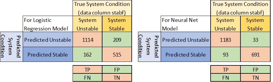
You’ll notice that this picture means I’ve flipped where FN and FP are in the ML Studio output, but it makes following along with the Wiki diagram easier…
The ROC curve and the importance of AUC values
If you’d like to see how an ROC curve is incrementally built up, I found a pretty decent reference. The thin diagonal line across the plot is the line marking predictions as random chance, having equal occurrences of success and failure… Think of it in terms of a coin flip – if guessing, you’re going to be wrong approaching half the time, if you do it long enough. That’s why the better models are those that show large gains in accuracy per false positive; those hugging the top-left corner of the plot. That results in a higher area under the curve (AUC) which is one of the primary measuring sticks of classification modeling.
You can also use the slider next to ‘threshold’ to change the point at which Stable and Unstable are predicted. Remember, we’re predicting probabilities of whether it’s one or the other, and the default is 0.5. But that’s not always real-life. There are often reasons why it needs to be a higher (or lower) threshold than that.
To put that in perspective, what would be worse: Telling someone they don’t have a fatal disease that they do, or telling someone that has a fatal disease that they don’t? The threshold value chosen needs to reflect the combination of societal and monetary considerations for each specific problem.
As with Neural Networks, there’s a ton of reading and available resources surrounding all these metrics. I’m not going to dive much further into it, but be sure to use the Wikipedia page as a launch point for your further education (I will, for sure)…
This might lead you to believe that our Neural Network model substantially outperforms the Logistic regression model. The AUC for the Logistic regression model is .887 and the Neural Net’s is .989. From a numbers-only perspective, it does. But there’s one big glaring red flag that has to be addressed!
Data Skepticism, Revisited…
Remember that this is a derived dataset, and not a real one. Predictions are going to be some function of the predictors the author has prescribed. For a live dataset, anyone that expects that they understand what they’re modeling to the point that they know ALL the valid predictors AND have access to data for ALL of them – is truly lacking in humility. We may know many of the predictors, and we may have a good idea of some of their interactions, but if you think you’re going to see a .989 AUC out in the wild, don’t hold your breath. And if you do, there’s a big likelihood you’ve squirreled something up. So give your work a second or third pass to see what the deal is.
The Winning Model, Available via a Service
So, we have a winning model of the two (given our red-flag caveat, of course) and while that’s great from an academic standpoint, it’s of substantially more use when we can put the model to work. Let’s say that for that hypothetical electrical grid, we’d like to be able to serve it up to any application that wants to take a set of current readings and predict its state. That could be once an hour, once a minute, once a second, or even more frequently. Whatever timeframe makes the most sense for the process being monitored and the cost of monitoring is what you should shoot for.
It would be nice to have the model in such a state so that a remote application could hit it and report to its owner. That could be a desktop, laptop, handheld, or whatever device would be capable of capturing readings, connect to the outside world, and report results. Azure ML Studio to the rescue once again…
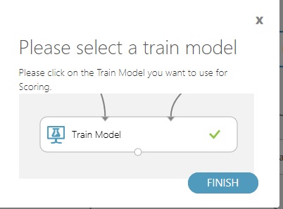
Down at the bottom, it’s time to set up a Predictive Web Service using our winning model. Click on the ‘Train Model’ control underneath the ‘Two-Class Neural Network’ control.
Choose the Predicted Web Service (Recommended) option and continue.

If you neglect to do the first step, and there are two or more model types in your experiment, it will tell you to choose the model to carry over to the web service.
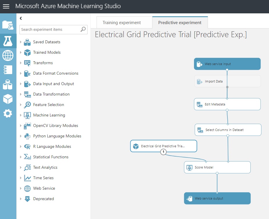
Once you confirm that, you’ll see another tab appear in your experiment. An animation occurs, building a web service entry and exit point. In between is the ‘meat’ of the path involving your winning model.
Click ‘Save’ and ‘Run’.
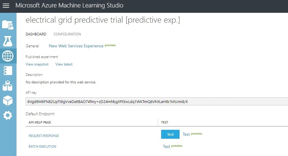
Now, we’re ready to deploy and test it out. Click on ‘Deploy Web Service’ at the bottom of the page. I’m not showing the full API Key that authorizes the connection, by the way. You’ll get one when you try this yourself.
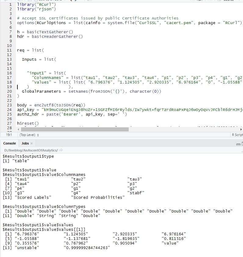
Now we’re going to test a manual request/response to the web service using one of our data rows as an example, supplying it the associated predictors and seeing what response comes out.
Also, we’re going to see it encapsulated in some R code and hit it from RStudio and an API call.
Request / Response Test
Here’s row 2 from the held-out 20%:

Click on the blue ‘Test’ button in the earlier image and enter the predictors ‘tau1’ through ‘g4’. Don’t worry about the screen asking for ‘P1’ or ‘stab’. They’re not used in the model. And ‘stabf’ is your output…
Be sure to click on the checkbox when you’re done.
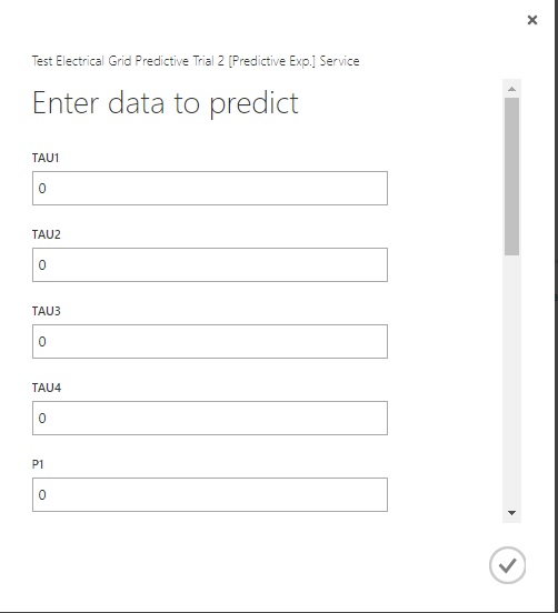
When you click the check box, it’ll run for a second and you’ll get the following, showing ‘unstable’ as our prediction.

Remote Call
Azure ML Studio also has some sample code to help you call this web service remotely using either R or Python. To get there:
Click on ‘Request/Response’ underneath ‘API Help Page’. You should get a screen like this:
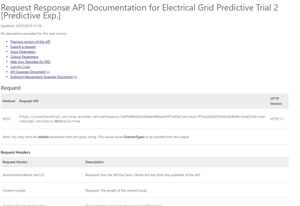
From there, choose ‘Sample Code’. Click on R, or Python, or even C++ if you’d rather run it that way. I’ll go with R and RStudio, feel free to take your own route:
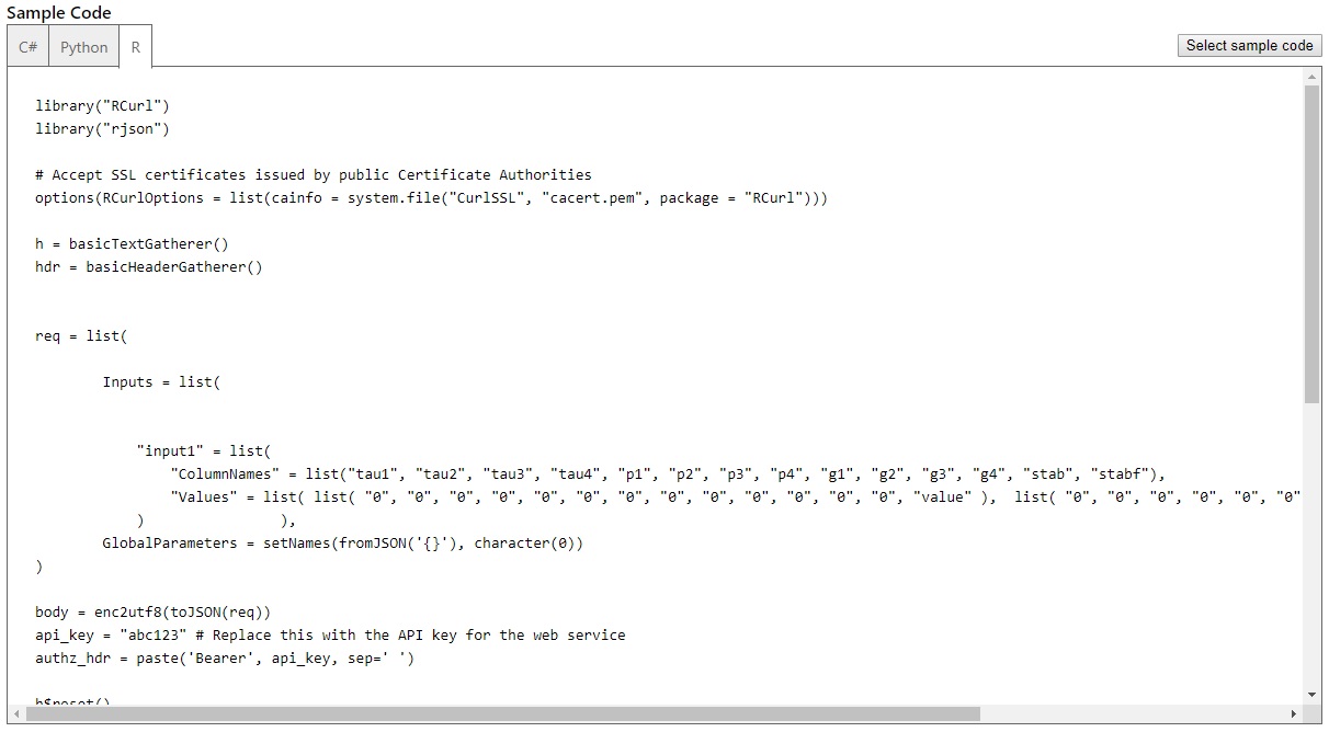
Be sure to switch out the API key with the one you receive. Also plug in the predictor values into the sublist named ‘values’, like we did before. Note: There’s boilerplate code for two lists of sample values, I only used one to replicate what we did earlier:
Final Thoughts
Well, that’s about all to cover what’s really just a summary of all the things Azure ML Studio can do. I’ve just barely scratched the surface… I encourage you to search out other references and take a deeper dive than I have here.
Thanks for following along !!
Links for reference:
The ML Studio help text for a neural network with binary classifier gives you some insight into the meaning of the parameters it uses.
And for goodness sake, if it were possible to ‘completely fill’ the Internet, ranking second behind cat pictures in filling it to the rim would be discussions of the processes surrounding neural networks. Here’s one source from Dr. Andy Thomas…
…as well as anything on YouTube under the search term: neural network tutorial