An Introduction to Microsoft Azure Machine Learning Studio - Part 4
Train/test data splitting and Model Scoring using Logistic Regression. Did I mention catnip?
Data Science Altitude for This Article: Camp Two.

Splitting the Data
Azure ML Studio gives us a handy way to split our data and provides some alternatives in doing so. I’ll mark 80% of our data for use in training the model, and 20% to use in scoring it with an eye towards which model is better when encountering new data.
With our split of categories to predict being roughly 60/40, there’s little to gain from ensuring that the division of data into 80% train / 20% test keeps to a consistent 60/40 split along those category percentages. We aren’t running the risk of an under-represented class being poorly predicted.
Nevertheless, I’ll show you how that can be done here in Azure ML studio. I’ll also show how to do a simple, random percentage split.
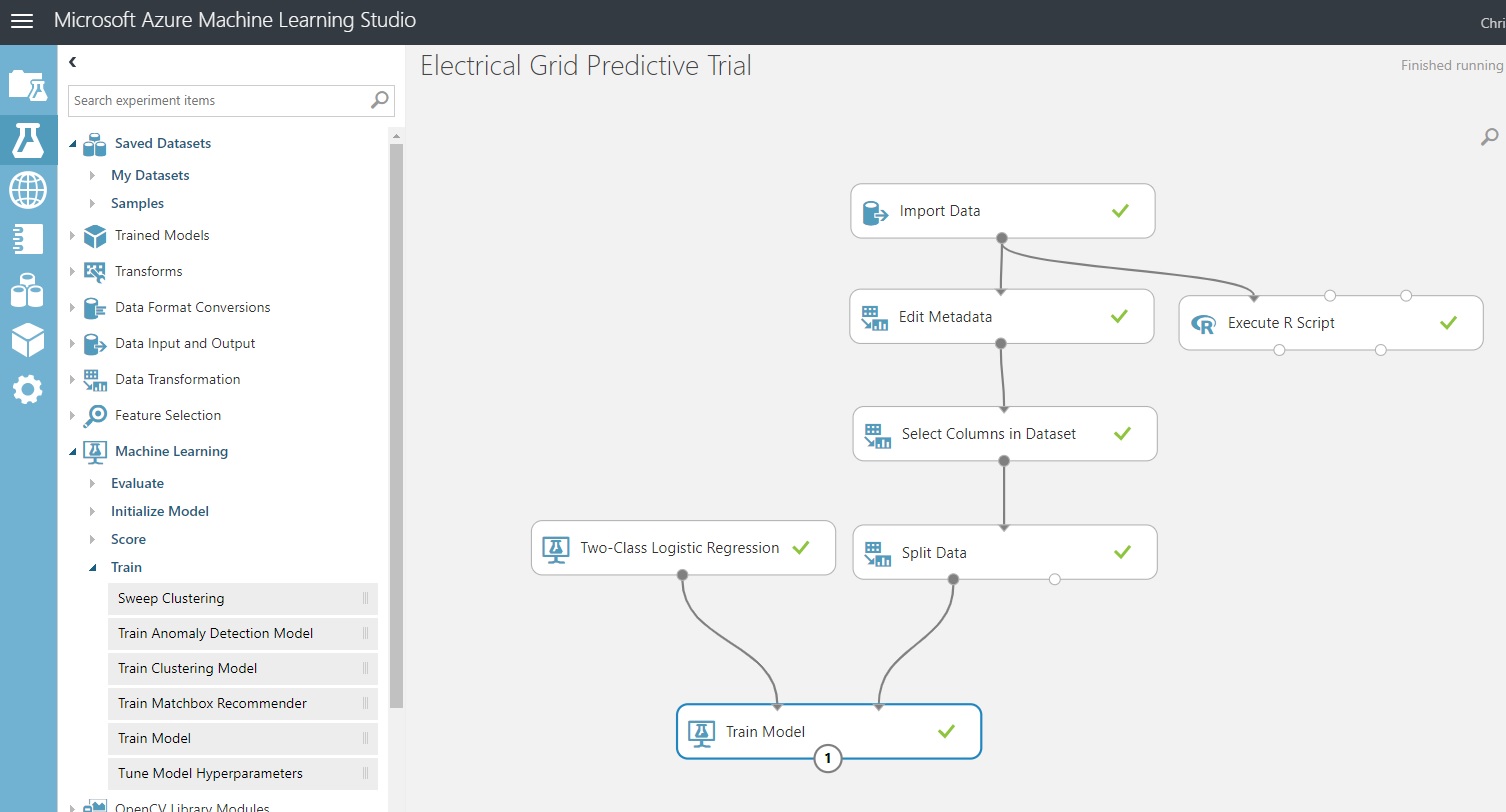
Under the ‘Data Transformation / Sample and Split’ experiment items, find ‘Split Data’ and drag it underneath our prior control that selected the columns to model from our dataset.
Attach it to that control as shown in the screenshot, and click on our new control to show its parameters.
You should have a screen that looks like the one below:
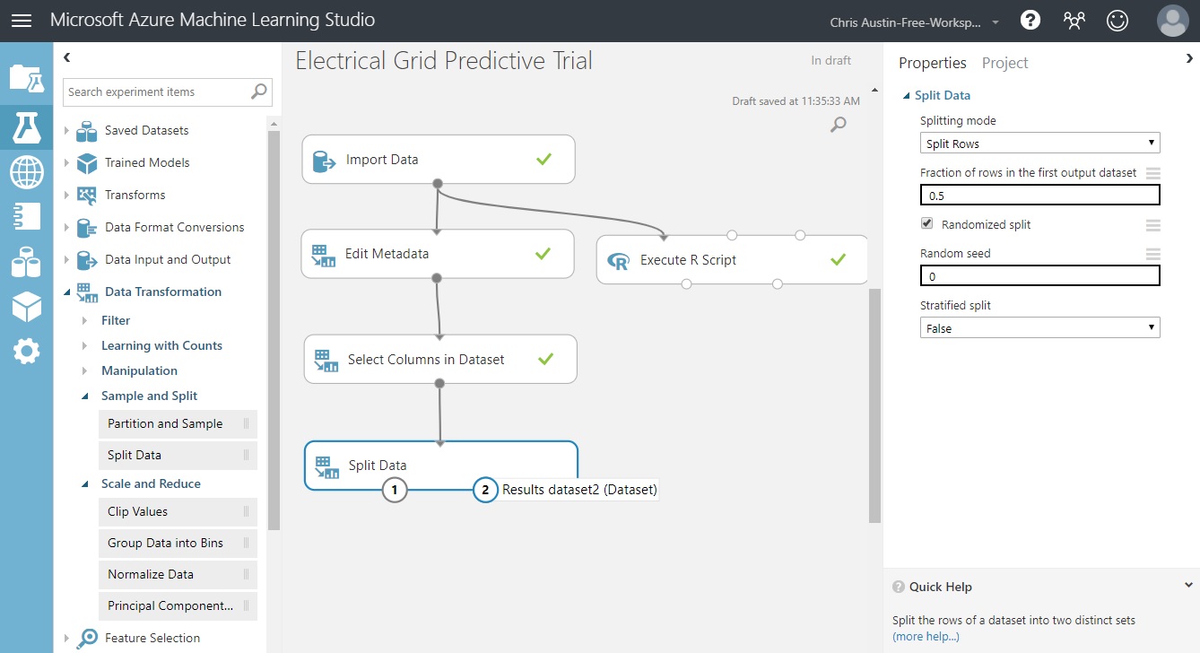
The input to ‘Split Data’ is our cleaned dataset. The two outputs are our train (port 1) and test (port 2) dataset splits. From here we can alter our split percentage, make it a randomized selection, and code for stratified sampling as we stated earlier. For extended details, the ‘more help’ at the bottom right will take you to the Azure ML Studio documentation. You can also get there through the right-clicking of any of the experimental controls.
But for now, let’s set it for stratification so you can see how that’s done. I won’t go through all the screenshots, but here’s what it should look like when you’re done with these instructions:
Change the split percentage to .8.
Change the ‘Stratified Split’ dropdown to True.
A column selector now appears. Pick ‘stabf’, our response variable that we want to stratify upon. Move it across to the ‘Selected Columns’ group like we did in the past several posts and click the checkbox to continue.
Click Save and Run at the bottom.
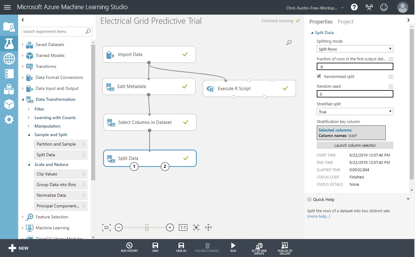
Taking the ‘Visualize’ option for ports 1 and 2 show 8000 records in one, and 2000 records in the other. Each has the same ratio of ‘stabf’ seen in the original dataset. So far, so good. Now, let’s add the next component.
Processing the Training Data and Identifying the Model Type
In the screenshot below, I’ve taken it in mid-mouse-drag for a reason. We’ll show instructions shortly for adding a ‘Train Model’ component here, but notice that only one of the input connectors is green. Why? The green one takes a dataset, and the red one is of type untrained model.
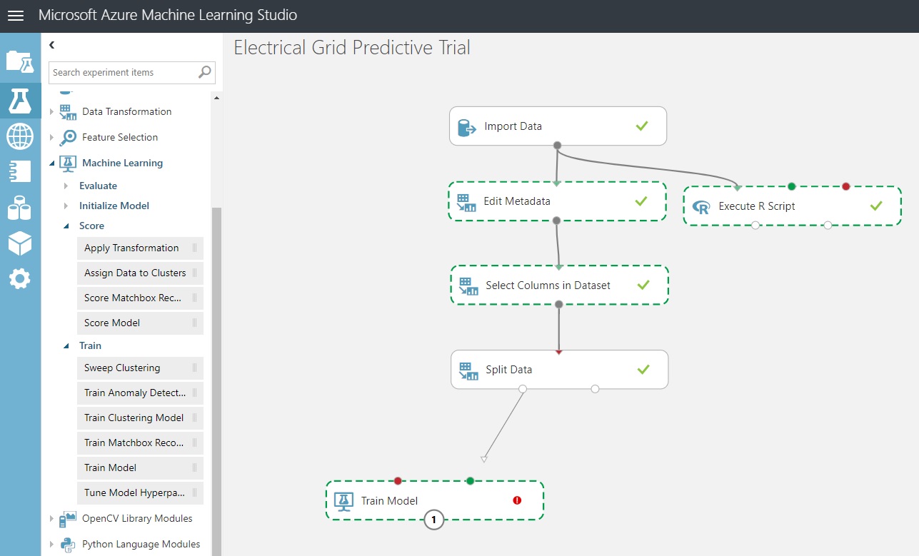
The red one is needed so that we can allow the model to initialize a model type: Our two-class logistic regressor…
If this seems clunky to you, it shouldn’t if you’ve seen the standard Python and scikit-learn implementation for setting up models. We need to specify our model type and then initialize it.
from sklearn.linear_model import LogisticRegression
logModel = LogisticRegression(<parameters go here>)
# THEN introduce the data to the model: fit it and score it, etc.
To get us to our next milestone, let’s do the following:
Add ‘Train Model’ from the experimental item group ‘Machine Learning / Train Model’. Or, type it into the search bar.
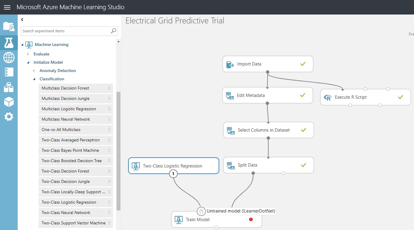
Add ‘Two-Class Logistic Regression’ from the experimental item group ‘Machine Learning / Classification’. We’ll take the default parameters.
Wire them together as seen in the diagram above.
We need to tell the Train Model control what the Label column is. That will get rid of the error flag you see above.
Go into the column selector for ‘Train Model’ and pick ‘stabf’. Click the checkmark at the bottom-right of the column selector.
Click ‘Save’ and then click ‘Run’.
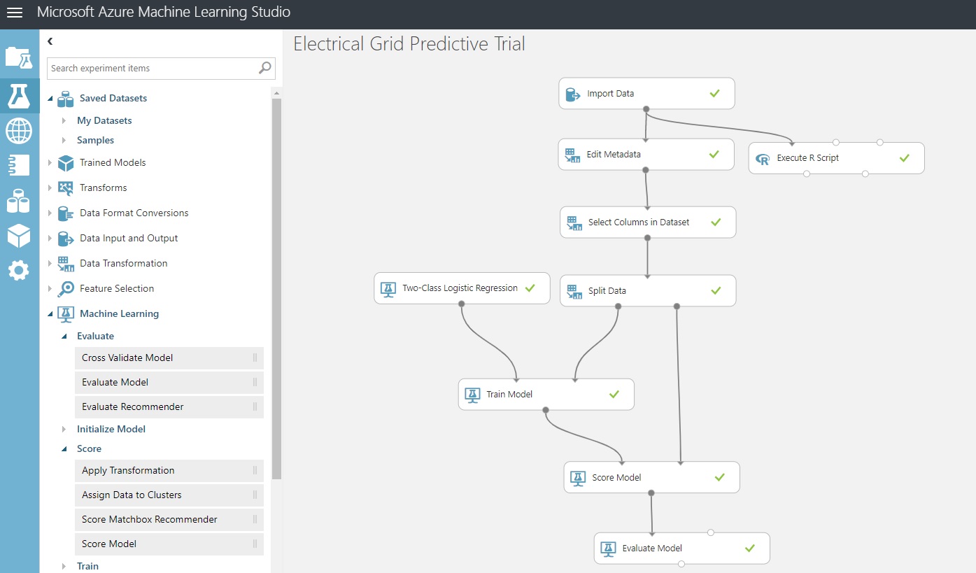
This should be the result:
Scoring and Evaluating the model
Well, it gets pretty simple from here. Underneath the ‘Machine Learning’ group we just worked with, there are also ‘Score’ and ‘Evaluate Model’ subgroups that we’ll be pulling from. First, scoring…
What does it take to score a classification model? We need the model we trained on 80% of the data, using it to see how accurate the predictions were for the test-bed 20% we didn’t use when training the model.
That takes us to the evaluation of the model. Azure ML Studio is going to show us some of the classic calculations and plots that help us to give a thumbs-up or thumbs-down to adopting the model.
To get to the screenshot below:
Drag a Score Model control from Machine Learning / Score. Its first port expects a trained dataset, and its second expects our 20% test data held out earlier. Connect them.
Drag an ‘Evaluate Model’ control from ‘Machine Learning / Evaluate’ and connect them.
Click ‘Save’ and then click ‘Run’.
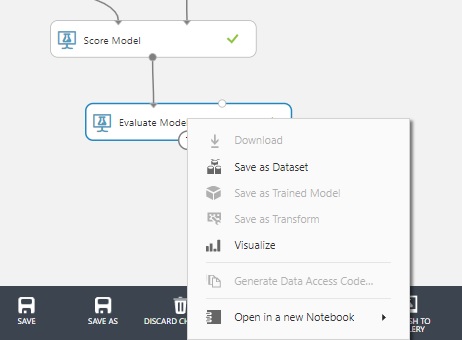
Evaluation Outputs - Choosing Visualize out of Evaluate Model
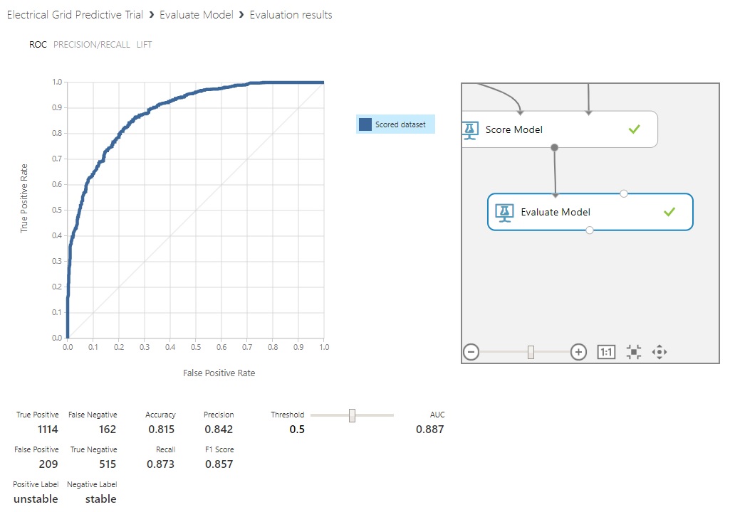
Clicking on the ‘Evaluate Model’ control gives us an option to see the results of our model:
We’re provided a Receiver Operating Characteristic (ROC) curve and some calculations that we’re going to save until our next post to cover in fuller detail. While I could go over them here, it would be nice to see them in contrast to another type of model’s results.
Next Post
In the next and final post of this series, we’ll attach a neural-network model, see whether it performs better, and discuss the evaluation process of ROC curves and their attendant properties. And, we’ll try to impart some wisdom on the subject of Confusion Tables.
Further Information on the Subject:
Homework for the next post: a Wikipedia article on ROC Curves. If you’re just starting out, this might be a less intimidating place to begin on the subject. It does have all the possible measurements, derivations and terminology in one place. Another neat aspect of the article is the ROC curve’s origin story from World War II.