An Introduction to Microsoft Azure Machine Learning Studio - Part 3
Further data cleaning, custom code for EDA, and a metric ton of catnip...
Data Science Altitude for This Article: Camp Two.

Our prior posts set the stage for access to MS Azure’s ML Studio and got us rolling on data loading, problem definition and the initial stages of Exploratory Data Analysis (EDA). Let’s finish off the EDA phase so that in our next post, we can get to evaluating the first of two models we’ll use to forecast stability - or the lack thereof - for a hypothetical electrical grid.
Let’s tackle our next two steps roughly in parallel: EDA and Data Cleaning.
Exploratory Data Analysis - Part 2 of 3
Let’s take a look and see if we have any missing data. From our ‘Import Data’ control shown in the prior post, click on it and take the ‘Visualize’ option.
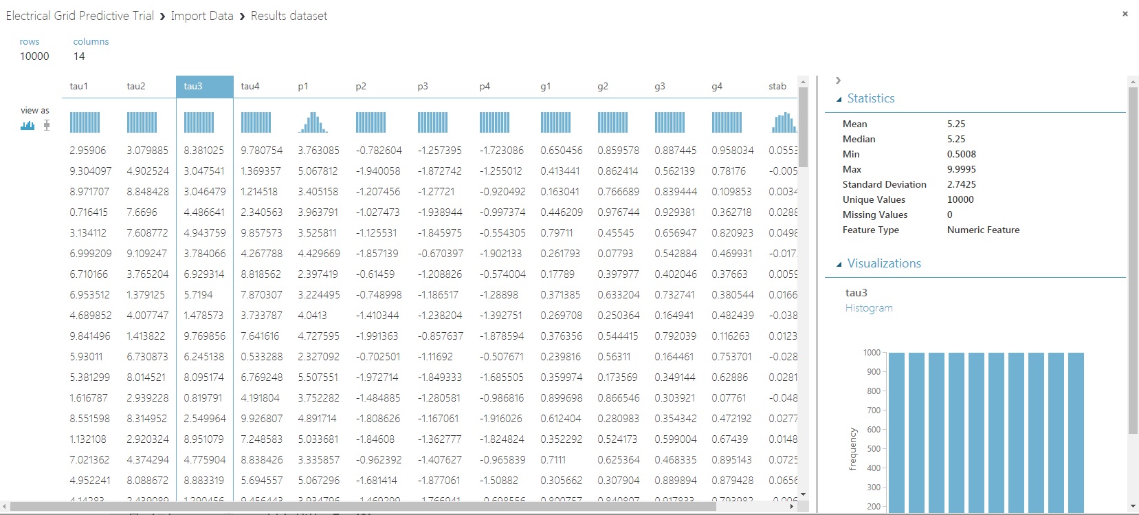
Notice in the ‘Statistics’ section that when predictor ‘tau3’ is chosen, we can identify that there are no missing values. Doing that for all the predictors as well as the response variable, you’ll see we’re in the clear.
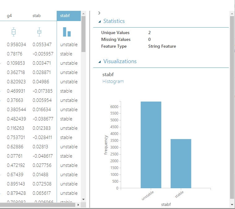
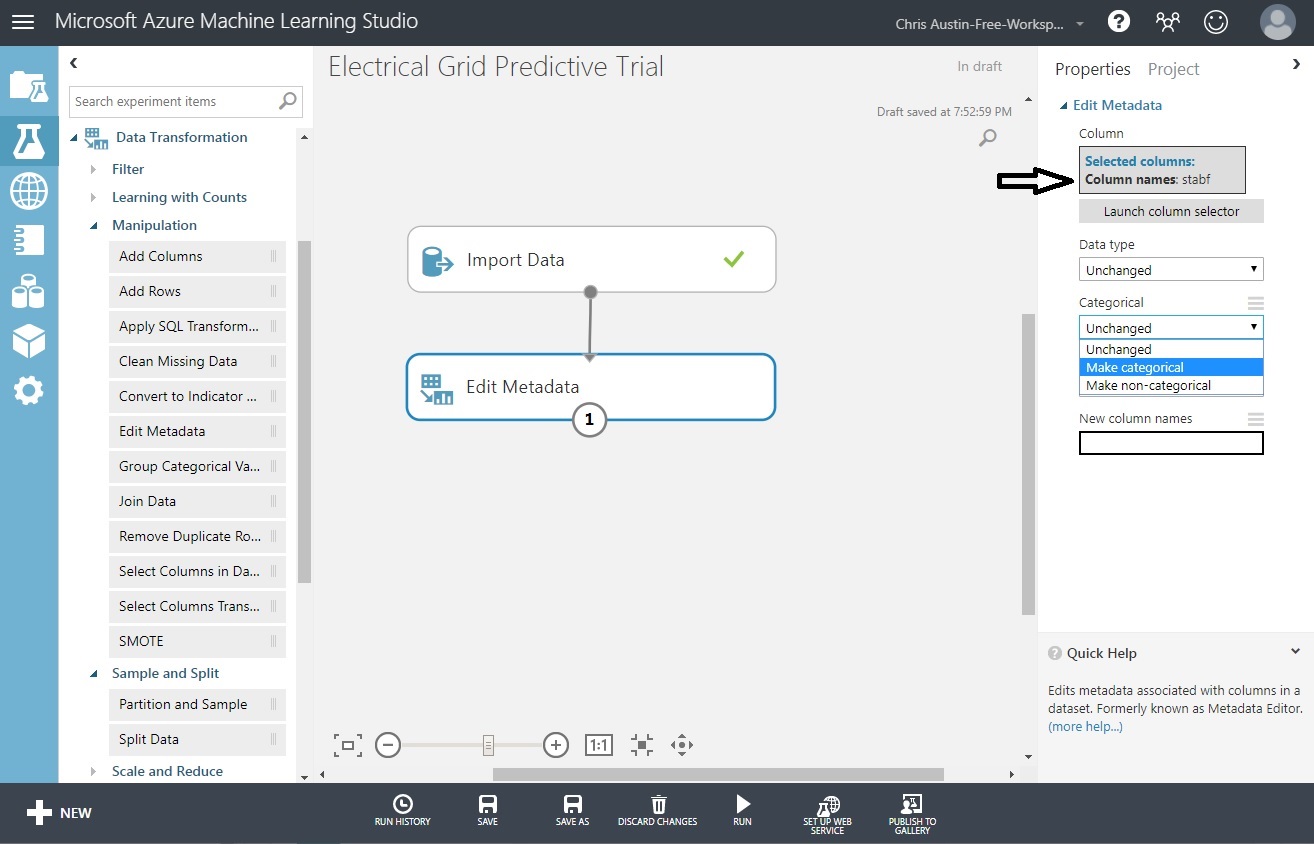
Also, take a peek at the distribution of our categorical variable, stabf. It’s currently considered a string and not as a categorical variable. Easily fixed, and we’ll do that shortly without a single line of code.
There are plenty of occurrences of each predictive class: roughly 60/40 unstable/stable (one tip-off to this being a contrived dataset). So no need to oversample the smaller group. We’ll have the option to ensure that our split of test and training data are both representative of their percentage in the dataset. That’s easily done in Azure in a stratification setting. We’ll show how to do that too, but in the following post.
Data Cleanup and Finalization for Model
If we did have some missing data points, Azure ML Studio has a whole section of controls under Data Transformation that will allow us to a) change stabf to a categorical variable and remove the extraneous fields that we won’t need for prediction.
To get to the state you see in the screen below:
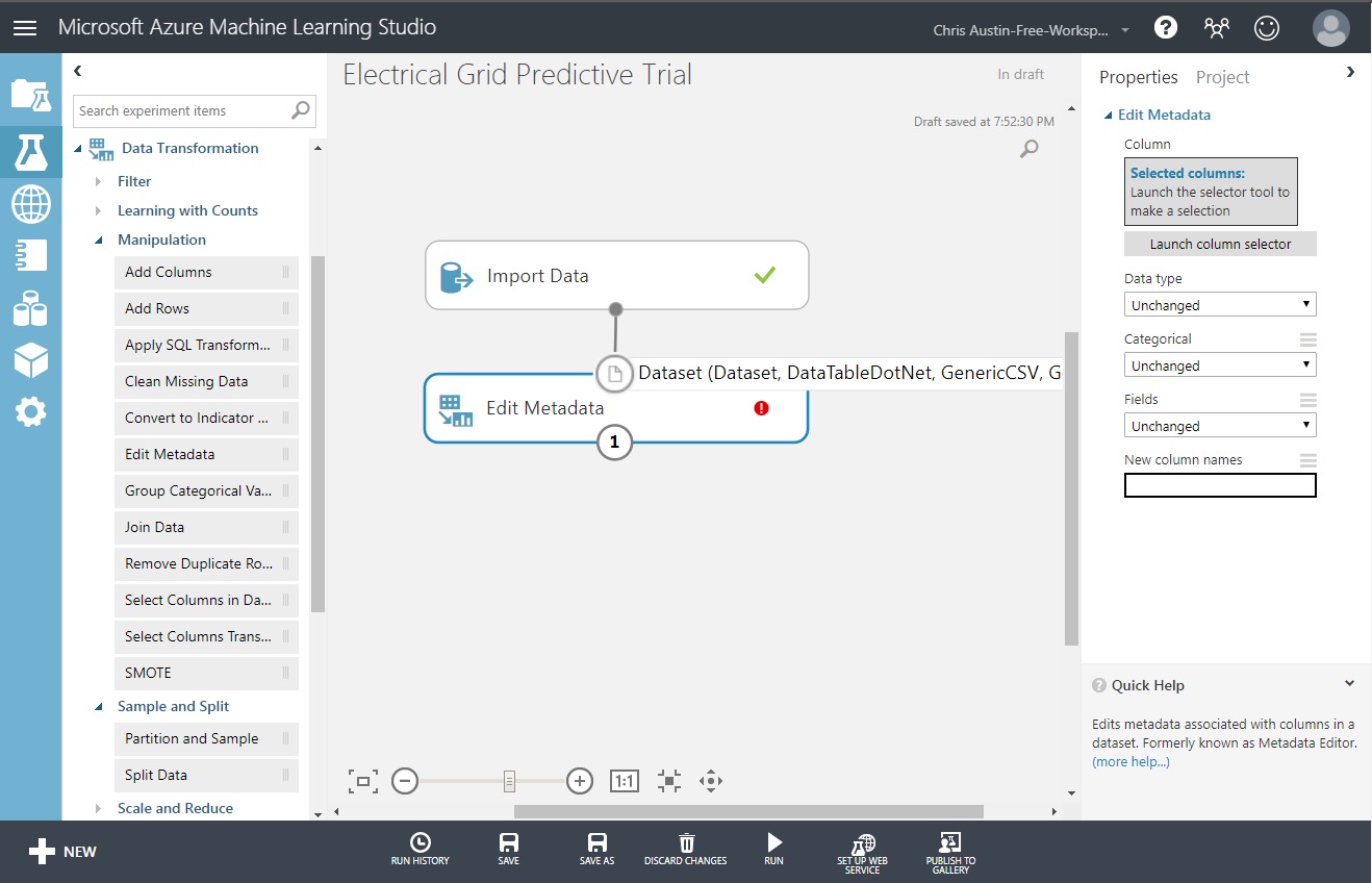
Drag an ‘Edit Metadata’ control and put it under ‘Import Data’. Mouse-drag from the bottom of ‘Import Data’ to the top of ‘Edit Metadata’ to connect them.
Click on ’Edit Metadata so we can resolve the error seen in the control.
As you dragged to connect those controls, you likely saw a mouse-over telling you what kind of object is needed to connect to it. Keep that in mind as we continue.
What we’re going to do here is select the stabf column and make it categorical. Here goes:
Click on ’Edit Metadata so we can resolve the error seen in the control.
The ‘Edit Metadata’ control allows us to change data types for one or more selected variables. To change stabf to categorical:
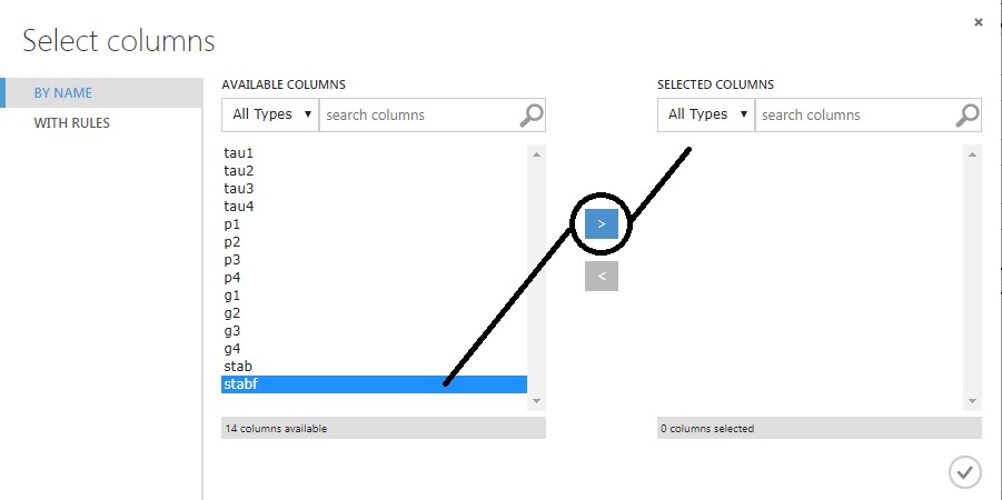
Click on ‘Launch column selector’.
Select ‘stabf’ from the list.
Click on the > control to move it to ‘Selected Columns’.
Click on the checkmark at the bottom-right to save.
That brings us back to our prior screen, where stabf is chosen. We just need to force the ‘Categorical’ drop-down to ‘Make Categorical’.
Click ‘Run’ at the bottom of the page. It’ll run for a moment and then both controls should have checkmarks. Try clicking on the ‘1’ above and choose ‘Edit Metadata / Visualize’. You’ll see that stabf is now considered a categorical field.
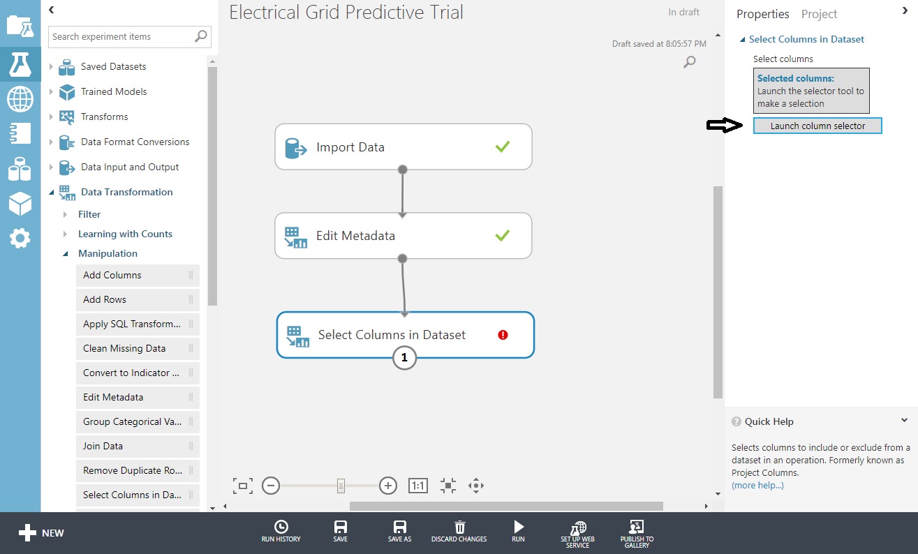
Next, let’s filter down our columns. I chose to run the experiment because I want the next control in the sequence to have availability to the output from the last one. You’ll find that adding too many new controls at once will keep them from being prefilled with data you’re expecting unless you run it as you go along.
Drag a ‘Select Columns in Dataset’ control and put it under ‘Edit Metadata’. Connect those as well.
Choose that control and you’ll get another ’Launch column selector out to the right, choose that too,
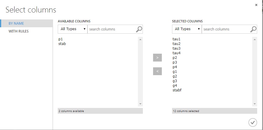
Move across all fields but p1 and stab, and click the checkmark. When you return, ‘Run’ it.
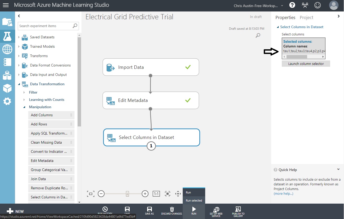
Returning back to the experiment screen you’ll see all the fields selected, and three checkmarks for successful completion after you run the experiment.
Exploratory Data Analysis - Part 3 of 3
Now that the data is ready for the model, let’s show how to run some code to expand on your EDA from within Azure ML Studio. This is optional on your part here; I’ll assume that most of your EDA is done outside of Azure.
Where I’d imagine the primary use of the custom code options would be not so much for EDA as my example below shows, but for extended data manipulation, or feature engineering. Creation of test and train splits on a different rationale than a static percentage - like when oversampling - could be another use case for custom code scripts. Whether it be an R script and using Tidyverse code, or a Python script and leveraging numpy and pandas, it’s your call.
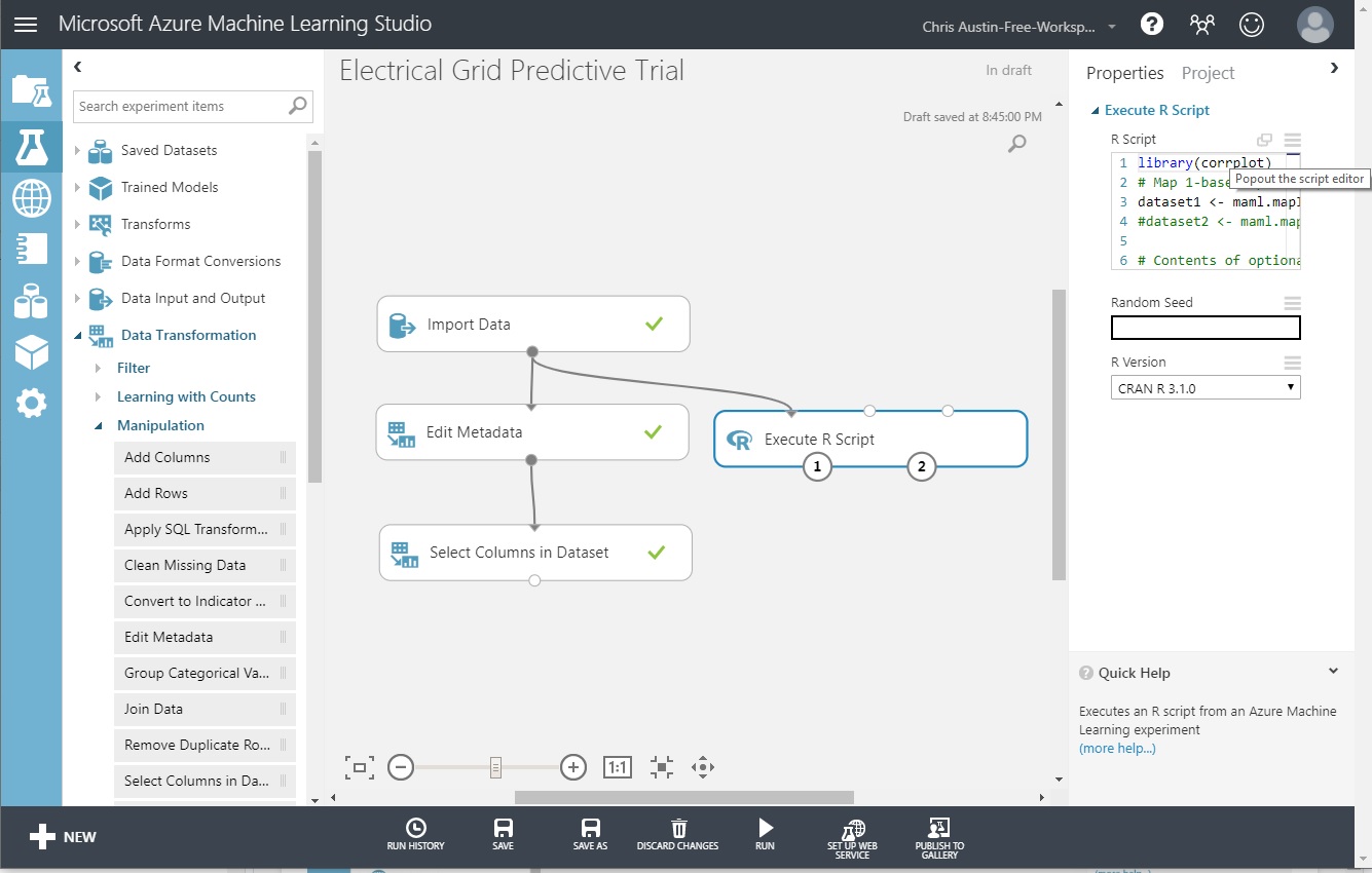
Drag ‘Execute R Script’ from the ‘R Modules Section’ experiment items.
Connect it to our ORIGINAL ‘Import Data’ control.
Change the ‘R Version’ to ‘CRAN R 3.1.0’
Click on ‘Popout the script editor’.
Enter the code, Save, and Run.
The code below (also at the bottom of this post) does some extended EDA on the ORIGINAL, all-column dataset so we can take a look at a) correlations between the non-predictive P1 and P2-P4, and b) correlations between other variables. Normally, if used to do some extended data cleaning as we discussed earlier, this control would be right in-line with the rest.
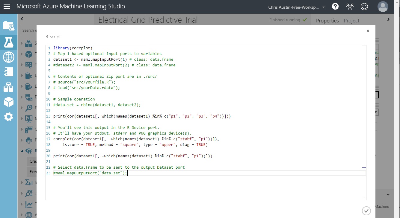
Note that the top of the code has ‘dataset1’ and ‘dataset2’ variables, initialized with a mapInputPort(n) call. We hooked ‘Import Data’ to the leftmost port in ‘Execute R Script’. Our dataset will be automatically loaded into dataset1, as type DataFrame.
We’re not using the second input port (going to dataset2) or the third (a ‘zip’ port for loading in an .rdata workspace). Those are commented out.
Also, the output of this control has two ports. (1) for feeding back a potentially changed dataset back into the flow as DataFrame ‘data.set’, commented out in the code. (2) is used for visualizing the R device output; showing items normally seen in the RStudio ‘Plot’ tab as well as standard-out and standard-error at runtime.
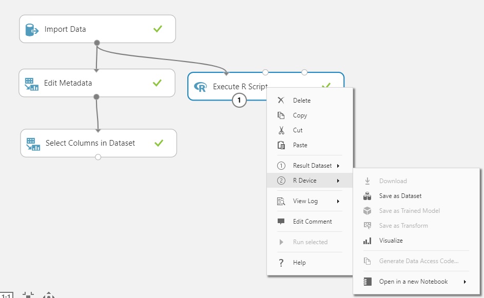
While you’d get this individually by clicking on each of the ports, you can get the info all at once by right-clicking on the control itself. Plus, any syntax or environment problems encountered during execution of your script are available under ‘View Log’.
Looking at the Outputs of the R Script
We’ll be able to see the following:
A correlation matrix of p1 and predictors p2-p4, to look behind why p1 was thrown out.
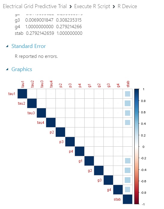
A correlation matrix of all predictors and the numeric stab response variable.
A visualization of #2.
Click on output port 2 (bottom right) of ‘Execute R Script’.
Click ‘Visualize’
Here’s what we get for correlations:
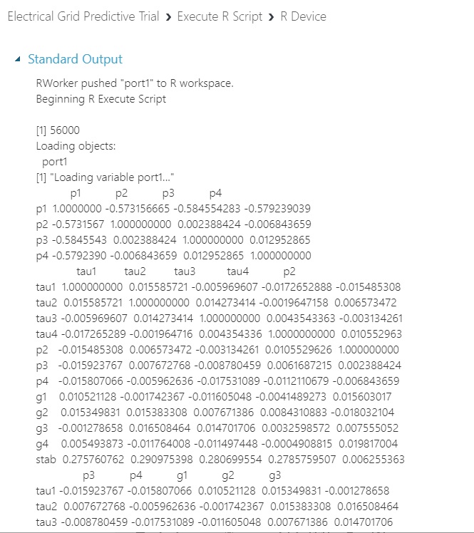
And here’s what we get with a plot of the predictors and the numeric response variable that corresponds to its categorical partner that we will proceed with: No inter-correlation issues between predictors or issues between predictors and response. I would have expected at least one of them to more strongly correlate with stab if we had a real-world dataset at hand.
Next Post
Upcoming - We’ll set up and evaluate a two-class logistic model to predict stability or instability of the hypothetical electrical grid. Amazingly, you’ll see that we’ve done most of the hard work here and prior…
Further Information on the Subject:
Code for the R script in the screenshot above - but be sure to first install the corrplot package:
library(corrplot)
# Map 1-based optional input ports to variables
dataset1 <- maml.mapInputPort(1) # class: data.frame
#dataset2 <- maml.mapInputPort(2) # class: data.frame

# Contents of optional Zip port are in ./src/
# source("src/yourfile.R");
# load("src/yourData.rdata");

# Sample operation
#data.set = rbind(dataset1, dataset2);

print(cor(dataset1[, which(names(dataset1) %in% c("p1", "p2", "p3", "p4"))]))

# You'll see this output in the R Device port.
# It'll have your stdout, stderr and PNG graphics device(s).
corrplot(cor(dataset1[, -which(names(dataset1) %in% c("stabf", "p1"))]),
    is.corr = TRUE, method = "square", type = "upper", diag = TRUE)

print(cor(dataset1[, -which(names(dataset1) %in% c("stabf", "p1"))]))

# Select data.frame to be sent to the output Dataset port
#maml.mapOutputPort("data.set");